Case · Branding and development
Noen: a brand for an energy supplier that lets your home use power when it is cheap. From name and logo to website, app and an interactive animation.
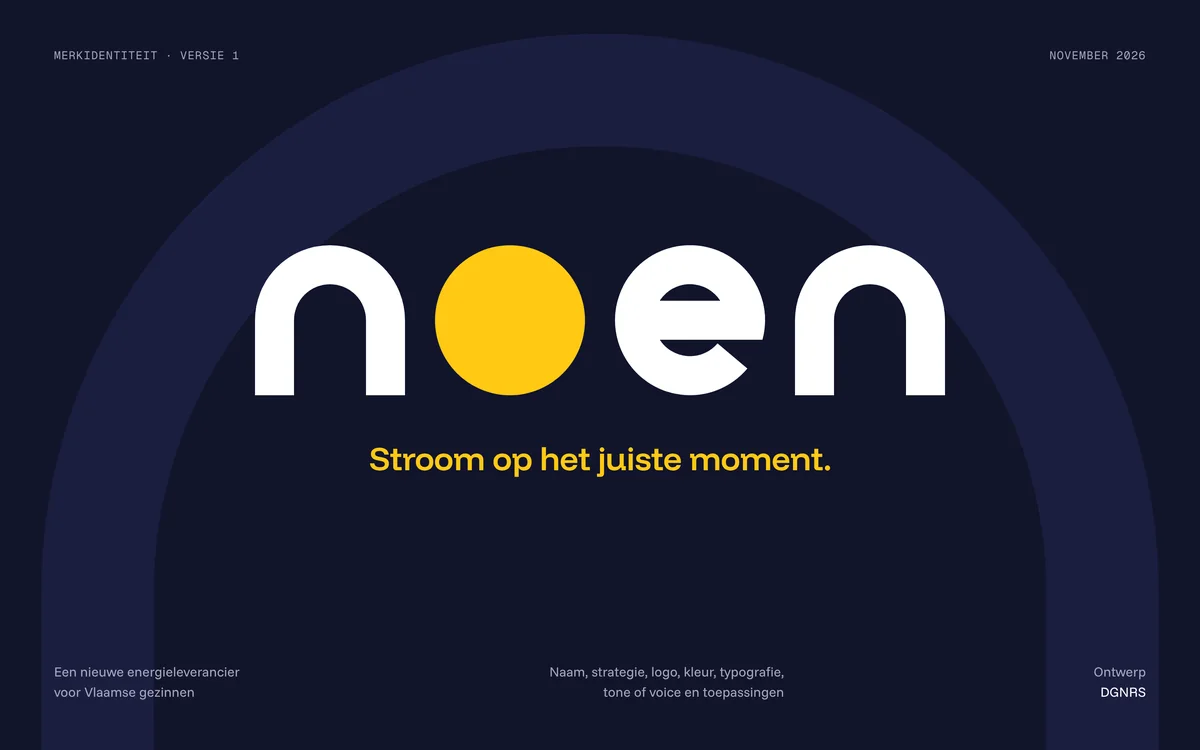
What
Brand identity and interactive animation
Parts
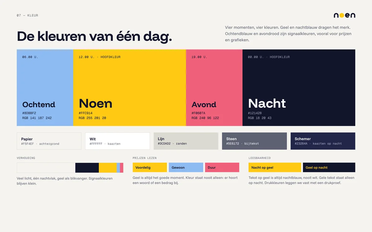
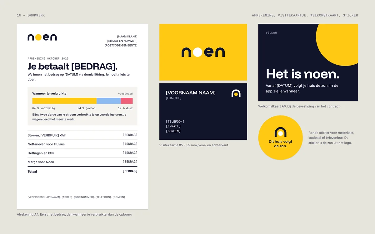
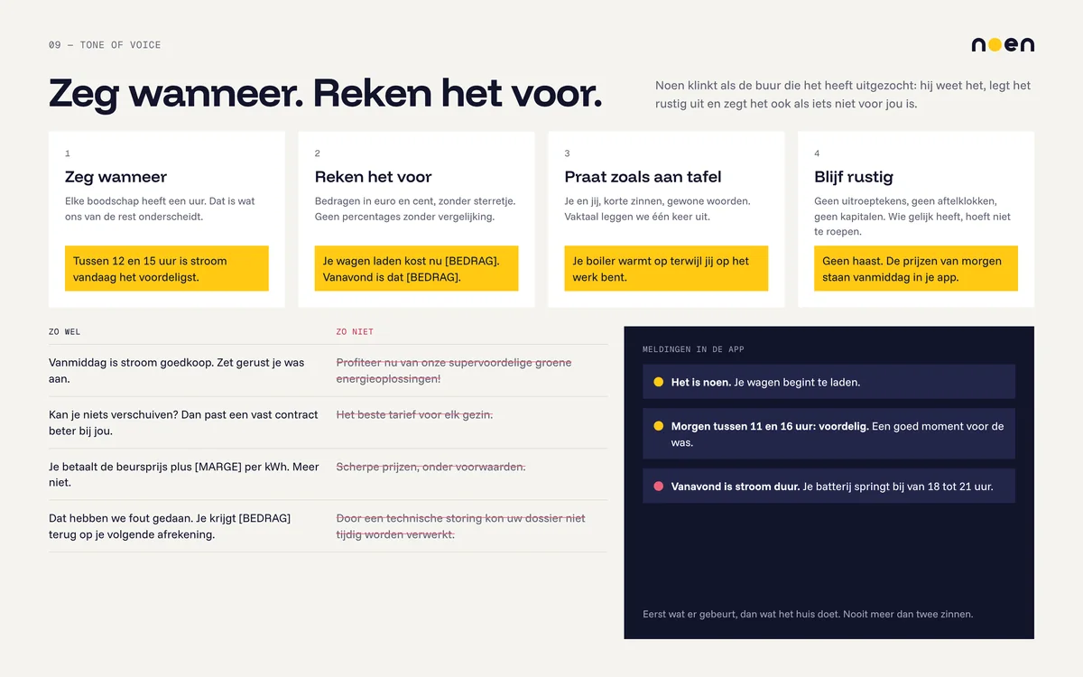
Name, strategy, logo, colour, typography, tone of voice, photography, icons, website, app, print and campaign
Design
DGNRS, 2026
Type
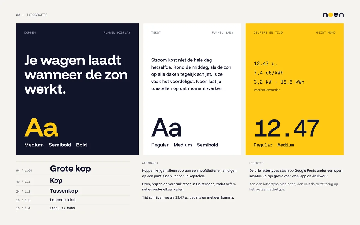
Funnel Display for headings, Funnel Sans for text, Geist Mono for figures
Power at the right moment
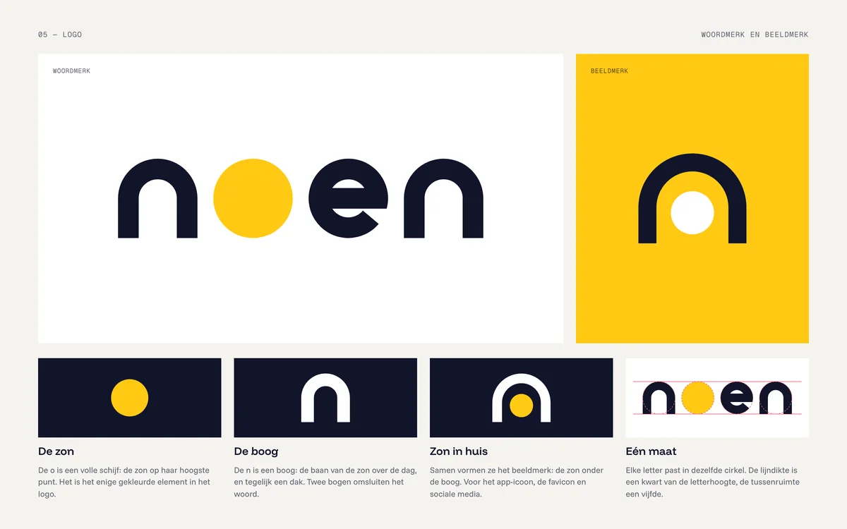
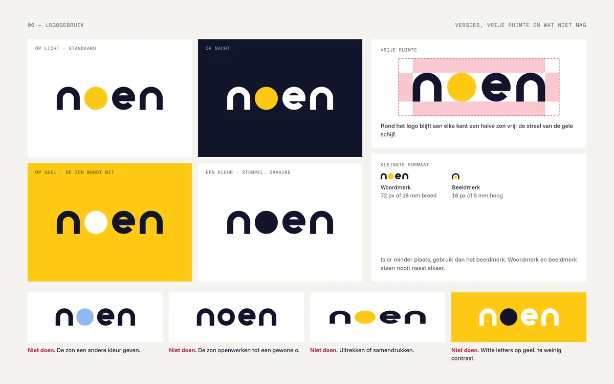
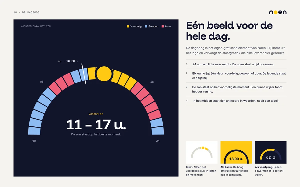
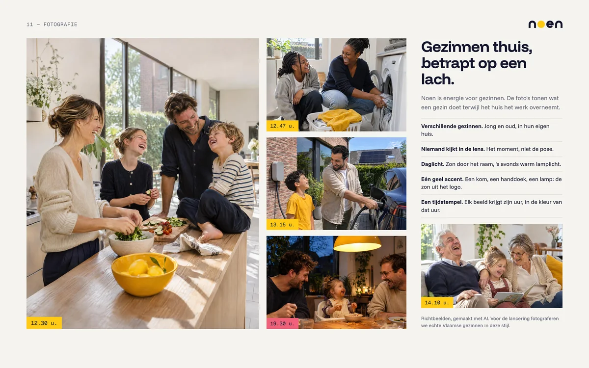
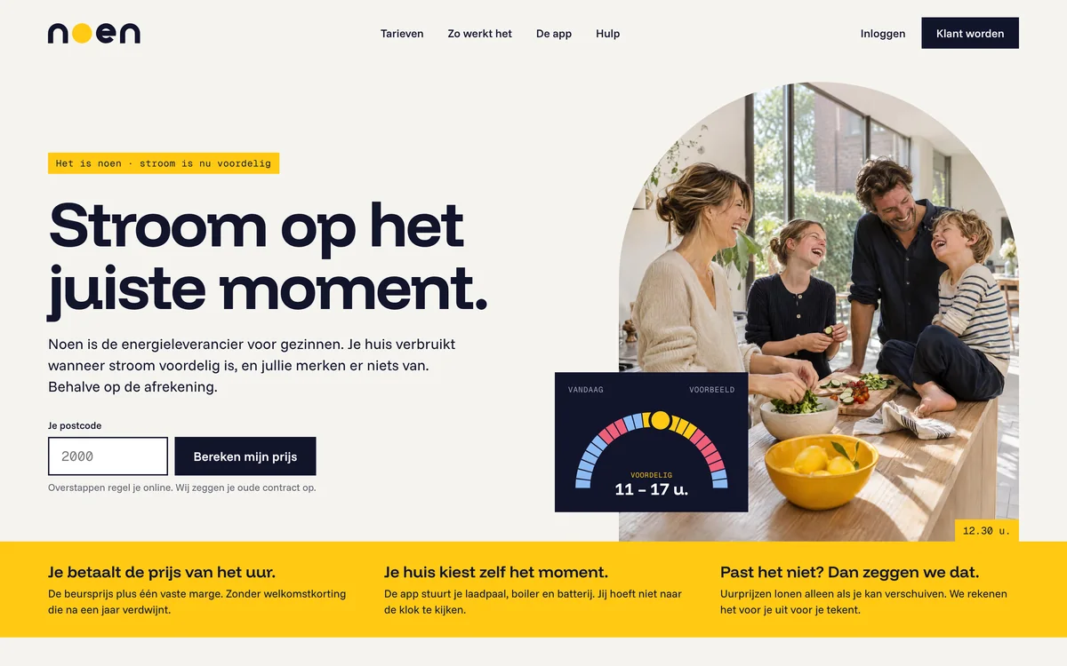
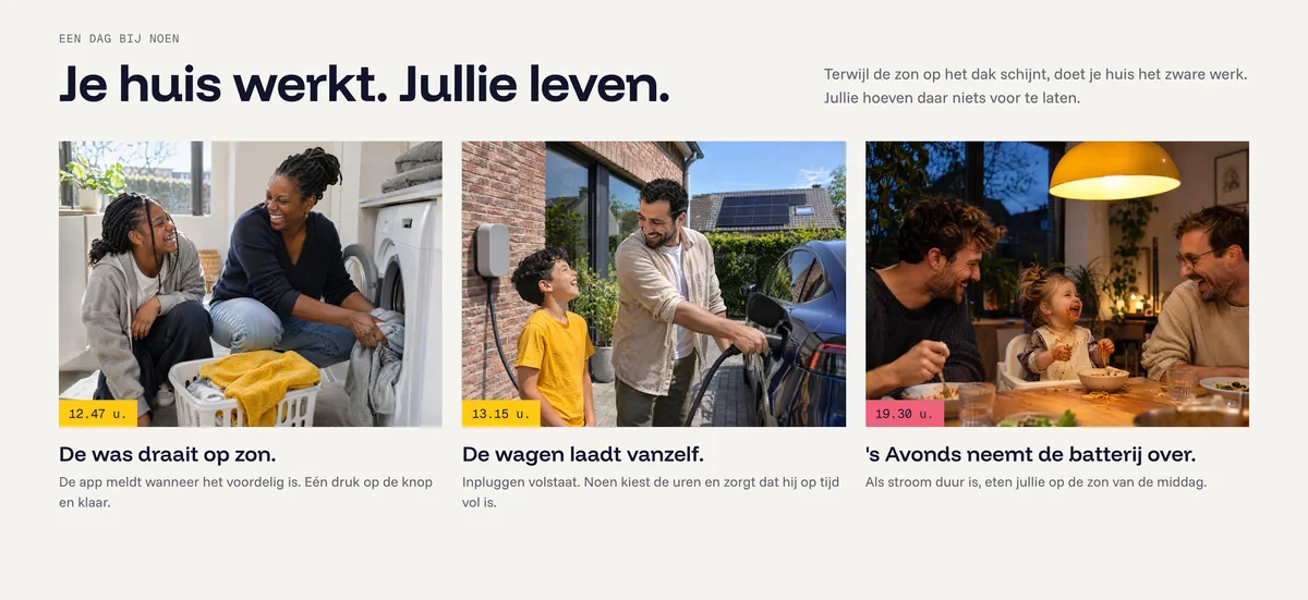
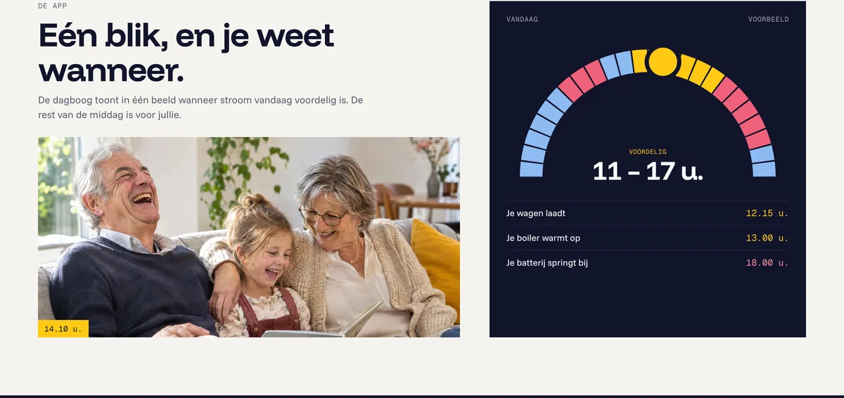
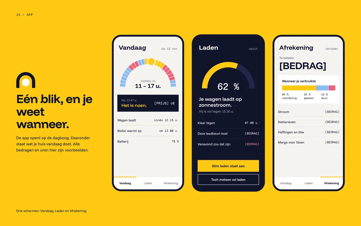
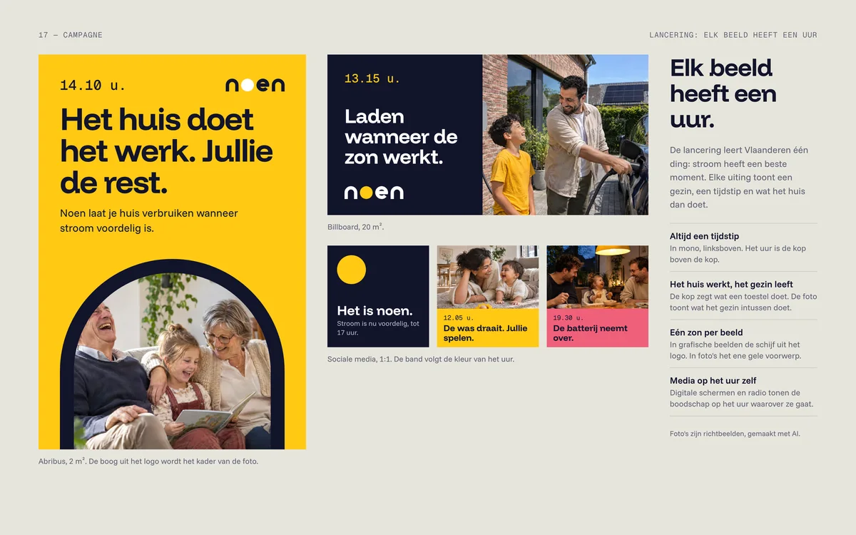
Noen is Flemish for noon: the moment the sun is highest and power is usually cheapest. The brand turns on that one idea. The o in the logo is the sun, the n is the arc it draws across the day, and the day arc shows at a glance when using power pays off. The photos show families at home, because that is who it is for. The designs are in Dutch, the language of the market.
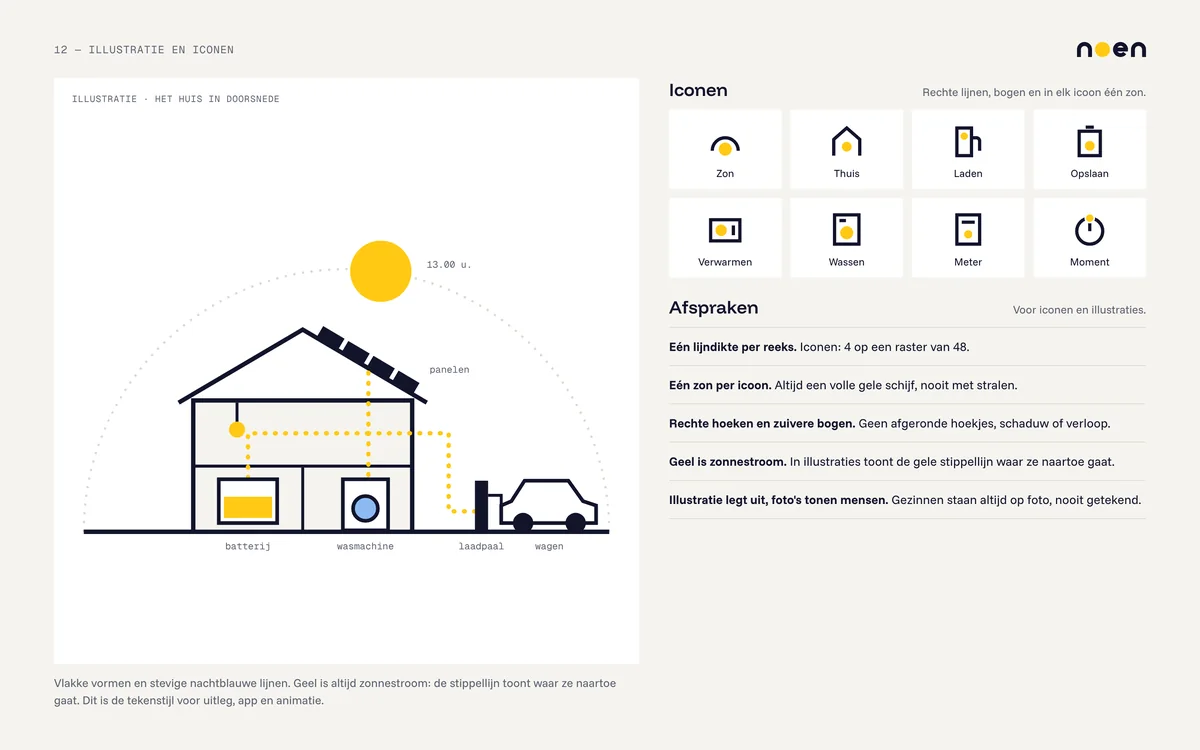
Noen was invented and designed by DGNRS. Name, logo and designs belong to DGNRS, all rights reserved. The family photos are guide images made with AI. The website and the app are designs, not working products. The animation runs on an illustrative model, not a real installation. Amounts and hours in the designs are examples.